You might be wondering why you’re looking at a pretty shabby photo of a toilet. Stay with me here. On my recent trip to Salvador, I had a wonderful opportunity to go to the equivalent of a home decorator show (Casas Conceitos) located in their Marina. More than a dozen little houses were built on the water’s edge providing designers a home to decorate. 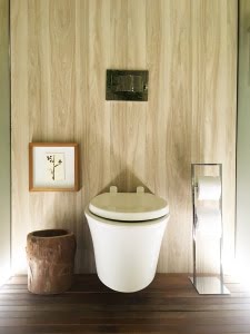
Room after room I was impressed with their use of materials, color, texture, scale and most of all placement of objects, art and furniture. Hence this bathroom vignette. Look where they put a painting! It’s fantastic. I never would have thought of that. Would you have? Do you have paintings in your bathroom and where are they?
I also loved the simplicity of the elements. Squares, rectangles, arcs, lateral and horizontal lines; it all works. This approach can be a game of how much can we take away yet still have flow (hehe) and a variety of shapes.
As I continued to explore other rooms I kept an eye out for where they were placing the art. It seems that hanging art low to the ground was popular. Little paintings were positioned at sofa height. Large paintings were set off to the side. Grouping a large number of framed paper pieces into a grid was a way to get a lot of art behind a 15 foot or more sofa. Some of these rooms were huge!
I’ve used these ideas of Placement and Taking Away recently in my little world. At a recent show with fellow artist Julie Cohn at the Sawtooth Building, I hung a small painting about 16″ from the ground. It worked! People noticed it because the presentation was re-imagined from the norm.
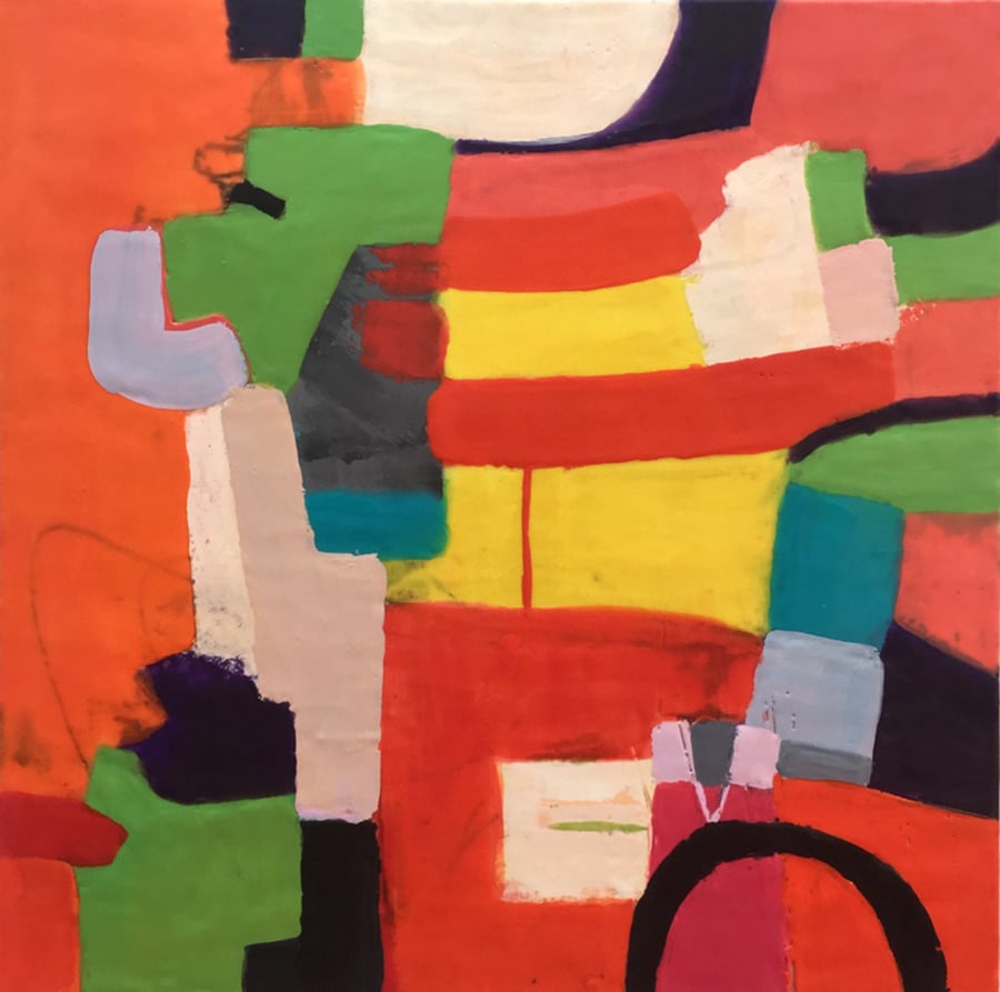
I’ve also been using the Taking Away concept on paintings that I once considered finished. Here is an example.

Old me.

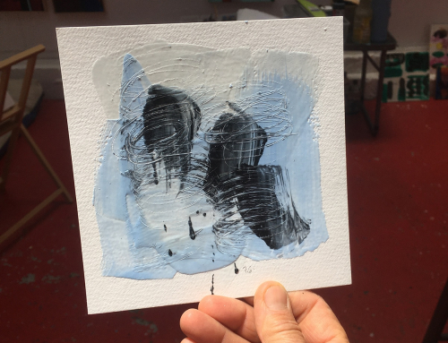
New me. I even found a new technique in the process!
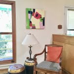
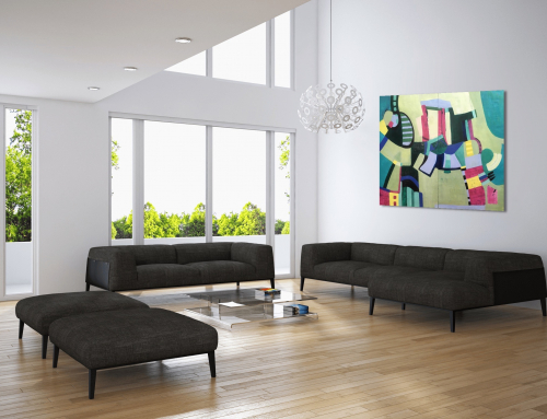
And brightening up this corner.
Thank goodness for travel!
So my invitation for you this week is to re-imagine some of your objects. Put them in places that seem unusual. Hang a painting low somewhere in your house. Be daring and delightful.
XOXO,
Francesca
PS: If you like design and furniture click HERE to see some images from the Brazilian Casas Conceitos show.
